THAT FOOD GUY
AN OPPORTUNITY TO INTRODUCE QUALITY FOOD AND SERVICE TO A GROWING TREND OF FOOD TRUCK VENDORS, 'THAT FOOD GUY' WAS ESTABLISHED.
BRIEF:
A logo brand was required to reflect contemporary food truck side of the business while also capturing the quality of catering performed at larger formal events.
A soft food like typeface in a stamp shaped icon lends itself to the contemporary side of the business. This is also relative and in contrast to the alignment of the ‘guy’ text and cutlery which gives support to the formal catering side of the business. Together they are pleasantly served / united on a organic shape, perhaps a dough, a pizza base,a plate or maybe a serving platter...
If you look hard you may see the 'Os of food' as eyes looking up to right thinking "Oh, That Food Guy'' while his moustache is subtle ligatures of the 'G and Y in Guy' ...Food for thought..
If you look hard you may see the 'Os of food' as eyes looking up to right thinking "Oh, That Food Guy'' while his moustache is subtle ligatures of the 'G and Y in Guy' ...Food for thought..
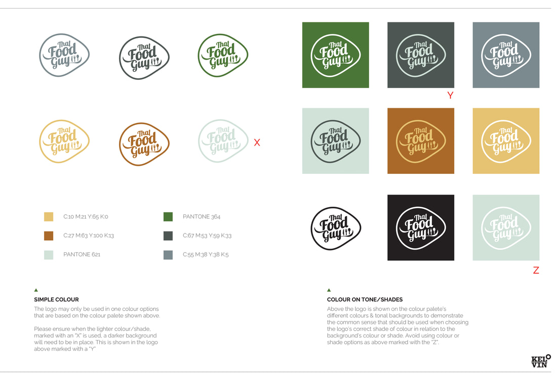
COLOUR PALETTE - MAY AND MAY NOTS
COLOUR PALETTE - MAY AND MAY NOTS
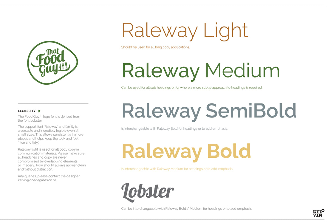
THE CHOSEN SUPPORT FONTS
THE CHOSEN SUPPORT FONTS
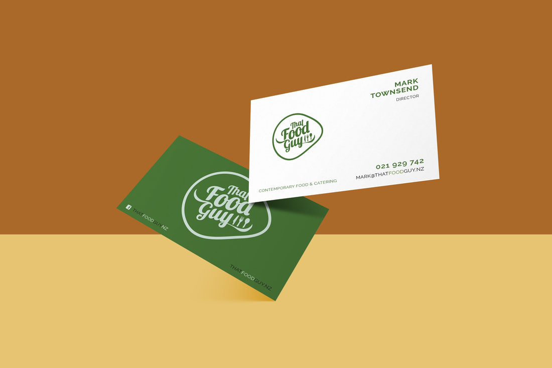
PRINTED 400GSM MATT WHITE STOCK
PRINTED 400GSM MATT WHITE STOCK
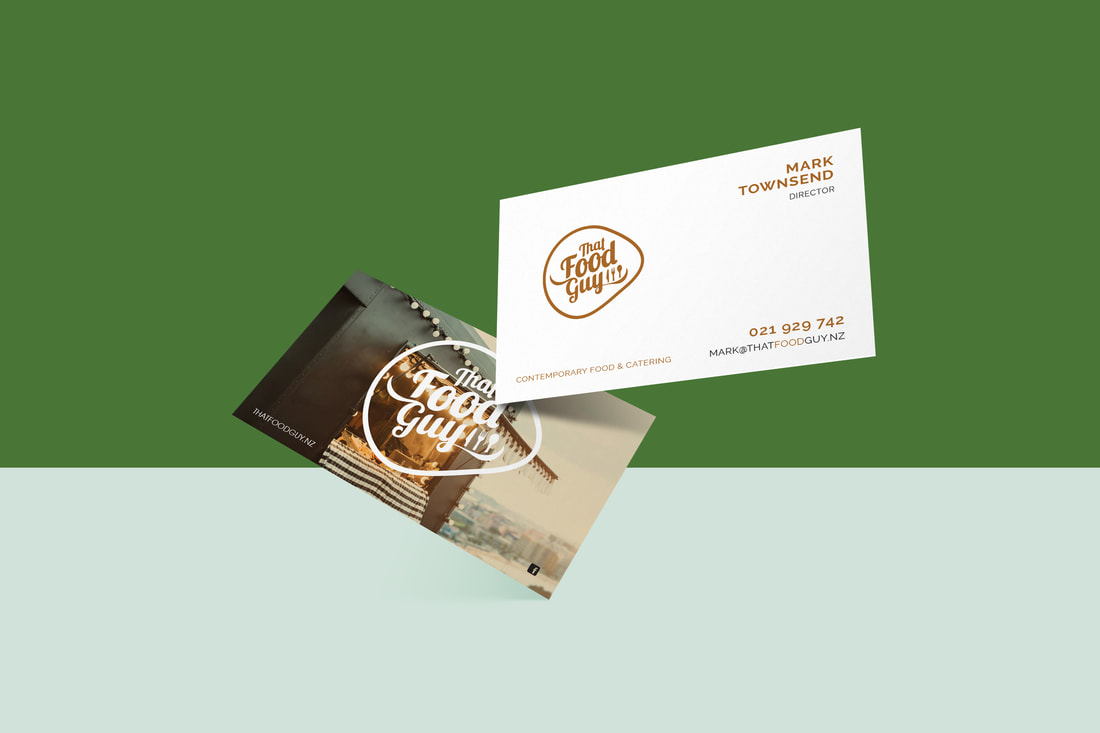
SUPPLIED BUSINESS CARD VARIANT
SUPPLIED BUSINESS CARD VARIANT